Feedback Form
| Introduction | Prodigy Layout | Tools Panel | Function Options |
Function Options
Meter
Metering is a way of viewing data from sensors without storing the data.
To view sensors Metering on your computer screen, firstly ensure SenSci
is turned on, has sensors connected and that the SenSci unit is connected
to your computer via a USB or Serial cable, then within Prodigy click
on the Meter icon, wait a few moments and Metering will begin. The default
display mode for Metering in Prodigy is the bar graph, other modes available
are numeric and colour changes, these can be viewed all at once or individually
(see display options). To exit Meter simply close the Meter window.
Log Setup
When data is 'Logged' it is stored in the memory in SenSci, from here
it can be transferred to your computer. In order to Log data the Log duration
and intervals must be set. This can be done on SenSci or through Prodigy
(with your computer connected to SenSci), If you want to view logging
as it happens on your computer screen you will need to use Prodigy. With
SenSci connected to your computer via a USB or Serial cable and all the
required sensors connected to the Logger, click on the Log Setup icon
within Prodigy. A 'Log Parameter Settings" window will appear with
the following options:
| Remote/Connected: Connected allows you to view logging as it happens on you computer screen, Remote allows you to set the parameters for logging to be carried out unconnected to the computer. Click the radio button to the left of the option you require. |
| Ports: A list of connected sensors are displayed with check boxes corresponding to each, un-check any of the sensors you do not wish to store data from. |
| Interval/Duration: Interval defines the amount of time between taking samples and Duration the entire length of a Log. Specify either the Interval or Duration by clicking on the corresponding radio button, then editing the numeric value and units of time. Absolute minimum interval or maximum duration can be selected by clicking the corresponding radio buttons, in each case one will affect the other, i.e. if you choose duration - maximum (30 days), the interval will update to a suitable value to allow this (according to memory space). The default is minimum Interval, i.e. 10 milliseconds, the default duration will be the maximum possible at this rate - if you then wish to reduce this duration you may click on the duration radio button and edit. The Interval and Duration are dependant on each other if you have set a combination that cannot be met by the available memory 'Sample Limit Exceeded' will be displayed, try changing the parameters, deleting old data files or reducing number of sensors. Once all is completed a confirmation window will appear, upon clicking "Finish" logging will commence. |
| Note: When Logging connected has finished the display window within Prodigy will close, to view and analyse this data you will need to transfer the file from SenSci. |
Open File
To Open pre-saved data files click on the Open File icon and browse the
location where the file was stored.
Download Data
To view and analyse data in Prodigy it must first be transferred to your
computer, this can be done by uploading from SenSci or downloading to
Prodigy. With SenSci connected to your computer via the USB or Serial
cable click on the Download Data icon. A Download window will appear displaying
the files available on SenSci, from here you can rename the file if required,
browse the save location and then save. If you wish to remove the file
from SenSci once downloaded to your computer ensure the check box is selected.
Once files are downloaded follow the Open File instructions to view it.
Save File
Once you have edited or manipulated a graph to display what you require
you can save simply by clicking on this icon.
Print
Upon clicking the Print icon the Print option window will appear, you
can print a Time graph of the data, the corresponding data table or a
screenshot of the current screen. Select the corresponding radio button
and click OK to begin printing. There are more print options under the
pull down File list (main window top left).
Display Options
When Logging, Metering or Viewing saved files you can select how your
data is displayed through Display Options. Firstly you will need to either
have the data file open or in the case of set up prior to Logging or Metering
you will need to select which you intend to do - this is necessary as
different display options are necessary for these two, a window will appear
with the two options and corresponding radio buttons, select the one you
require. Next the Display Options window will appear, the list of display
modes is as follows:
| Time Graph: The default display mode for all saved files and Logging, this format displays data points against time (unless otherwise specified, see advanced options). All Tools Panel items are applied to this display mode. This mode is not available for Metering. |
| Bar Graph: The Default display mode for Metering, this is also available for Logging connected and Playback. The bars represent the range of the sensor and the coloured fill represents the instantaneous reading as a proportion of that. The sensor unit and actual reading are situated above the bar, the sensor label is placed vertically, to the left of the bar. |
| Colour window: Available for both Logging, Metering and Playback, this display mode shows connected sensors as a colour shade between two extremes representing the maximum and minimum values. The colour at any given moment represents the sensor reading, its shade defines the position on the overall scale. Although less accurate this display mode is useful in explaining experimental changes to younger children. |
| Numeric: Displays the instantaneous numeric value of data, the font colour corresponds to the channel colour. This mode is available for Logging, Metering and Playback. |
| Data table: Shows all data in a spreadsheet format. This mode is available for all functions except Metering. |
These display modes all have a check box next to them in the Display Options window, you can select your display mode by selecting the corresponding check box. A maximum of four display modes can be viewed at once. Display modes not available in the current mode (i.e. Metering, Logging etc..) appear grey and cannot be checked.
Within the Display Options window under display modes, there is a collection of toggles (for each option you can have one or the other). The options are as follows:
Selection tool - pointer/cross-hair
Data points - separate/joined
Graph grid - off/on
In the top right of the Options Window there is a time graph labelling box, this allows you to label the title and axes.
Advanced Display Options
Click on the advanced tab within the Display Options window to access
these features. Firstly you can select between having a standard single
'y' axis or a double allowing the labelling of two scales, select the
corresponding radio button of the option you require. Next you can specify
the axes, drop-down lists allow you to select the sensor scale for that
axis, the default for the 'y' axis is time but it is possible to plot
sensors against each other. These options apply to the time graph display
mode and changes made are specific to the Channel at the top of the Channels
list so you can have different preferences for different Channels. To
the right of the Advanced Display Options window there is a box allowing
you to set the limits of display axis for specific channels, edit the
values in the boxes or click on 'Full Scale' to restore the original setting.
Analysis
Select the Analysis icon to access the following options:
|
Calculations:
|
| Curve Smoothing Curve Smoothing allows you to artificially smooth out large variations to create more stable data. Select the Channel you wish to apply to, select the mode of smoothing you wish to use, Fourier or Median then move the slider to the desired level. If you don't want to corrupt the data on a channel you can select the 'Create a New Channel' check box and a separate channel will be created leaving the original intact. |
| Gradient You can determine the gradient at any point on a graph by selecting Gradient within Analysis. When the Gradient window appears select the channel you wish to analyse from the drop-down list, then simply click on the desired point on that channel in the active graph window. The 'x' and 'y' coordinates are displayed along with the gradient at that point. Click the point button to select another point. |
| Curve Fitting You can apply standard line and curve formulae to existing data sets to analyse and predict behaviour. Within the Curve Smoothing window select the channel you wish to apply it to. From the drop-down formulae list select a formulae you think best represents the graph, from the Channels drop-down list select the channel to plot the new curve under then select fit, this will automatically select the most appropriate coefficient and constant values but you can manually change them. Click OK and the new curve is created. |
|
Formula Application e.g. You want to remove room temperature from a temperature experiment but save the new data as a different channel so that the original is not lost - the window should look like the following; 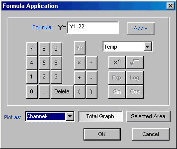
First Temp is selected from the menu and the 'Yn' button clicked, so that Y=Y1 (this would create an exact copy of the temperature layer). Next you want to subtract 22 so click the subtract button then 2 2. Now select the channel you want to save the new graph under, 'Plot as:' has a drop-down menu adjacent to it select the channel from this, (in this case Channel 4 was the next free available). Next click 'Apply' and finally 'OK.' |
Playback
Allows you to view data files as an animation to re-create the logging
process. Click the playback option to access the Playback File Open window,
browse the file you wish to see then select Open. A Graph window will
appear with playback controls below, press play to view the samples log
at a steady rate or FFW to see them appear at an accelerated rate, press
Pause to freeze display or Stop to revert to the standard graph view (data
will be displayed only up to the point stop was pressed). A slider bar
allows you to easily move to different sections of the log file and the
Values boxes give a reading for each channel at each point.
Display Toggles
Different display modes can be chosen or removed quickly using these toggle
buttons, click on active modes to remove and inactive modes to apply.
See Display Options for a detailed description of each mode and where
it can be applied.
Help
Available help files can be accessed by pressing the Help icon.
| Back to top |
|---|